In a narrow window the top bar's two sides, "µPaaS by @sneak" and the New App and Logout buttons, ran into each other. The cause: only justify-between held them apart, with no gap and no wrapping, so at 390 px "@sneak" ended 2 px before the New App button. At any narrower width, or with wider fonts, the gap was gone entirely.
The bar's row now has flex-wrap and gap-3. When one row is too narrow (below about 400 px with the fonts in the screenshots), New App and Logout move to a second row, left-aligned. Wider windows keep one row with at least that gap. The desktop layout is unchanged. The top bar is the same on every logged-in page; the screenshots show the dashboard.
static/css/tailwind.css has no build step in the repo, so the fix uses only classes the committed file already has; the file is unchanged. That ruled out hiding "by @sneak" on small screens, which would need sm:inline. The duplicate New App button stays.
The test checks that the bar's row carries the wrap and gap classes. Whether anything overlaps depends on rendering, which the screenshots show.
Screenshots of a local build, logged in, in a headless browser (taken at twice the pixel density):
Before
After
390 px
1280 px
Model: opus-5-5
In a narrow window the top bar's two sides, "µPaaS by @sneak" and the New App and Logout buttons, ran into each other. The cause: only `justify-between` held them apart, with no gap and no wrapping, so at 390 px "@sneak" ended 2 px before the New App button. At any narrower width, or with wider fonts, the gap was gone entirely.
The bar's row now has `flex-wrap` and `gap-3`. When one row is too narrow (below about 400 px with the fonts in the screenshots), New App and Logout move to a second row, left-aligned. Wider windows keep one row with at least that gap. The desktop layout is unchanged. The top bar is the same on every logged-in page; the screenshots show the dashboard.
`static/css/tailwind.css` has no build step in the repo, so the fix uses only classes the committed file already has; the file is unchanged. That ruled out hiding "by @sneak" on small screens, which would need `sm:inline`. The duplicate New App button stays.
The test checks that the bar's row carries the wrap and gap classes. Whether anything overlaps depends on rendering, which the screenshots show.
Screenshots of a local build, logged in, in a headless browser (taken at twice the pixel density):
| | Before | After |
|---|---|---|
| 390 px | 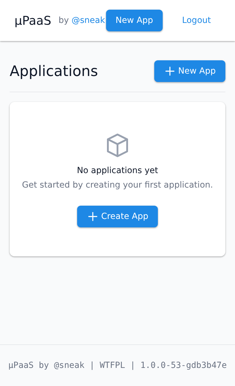 | 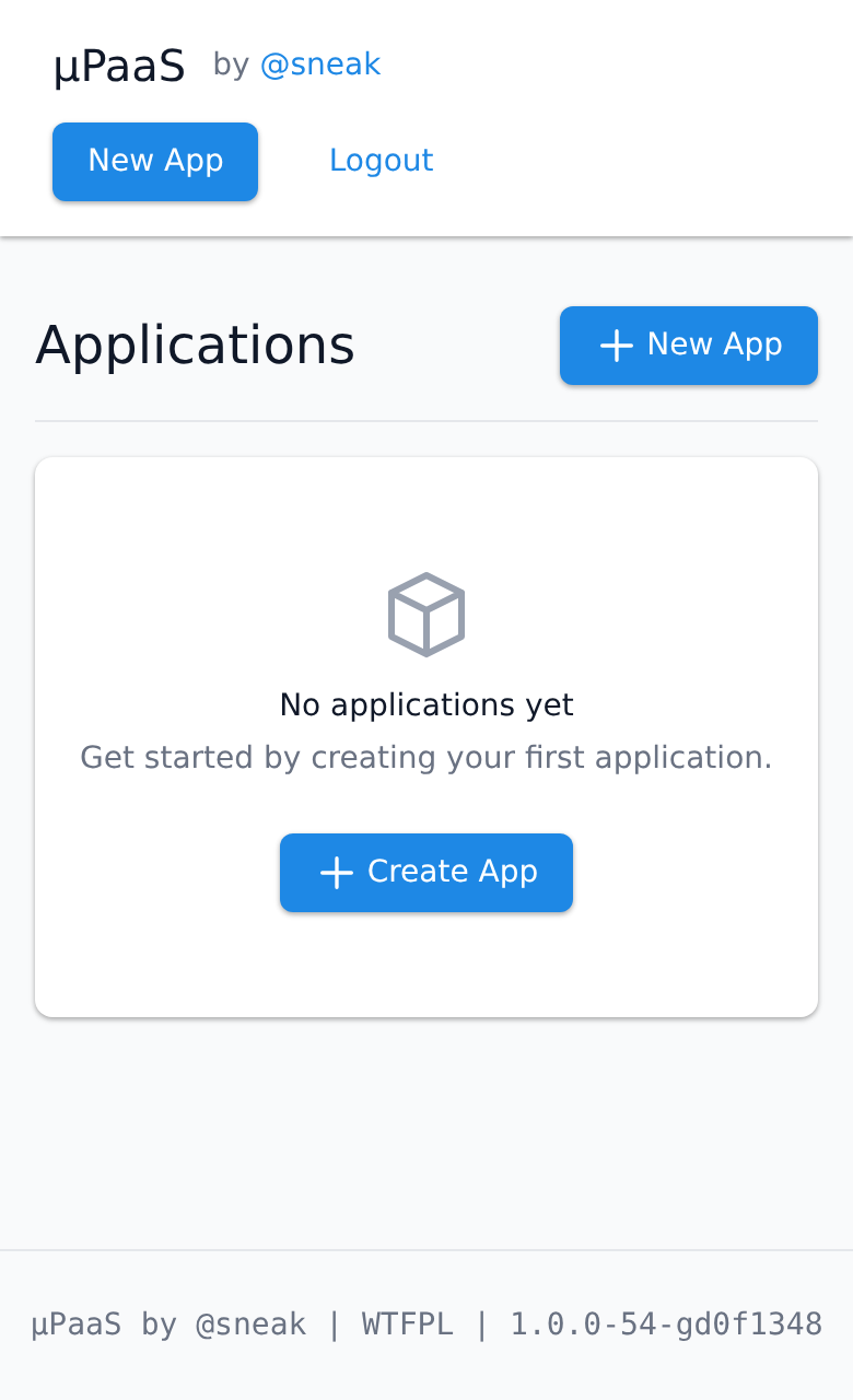 |
| 1280 px | 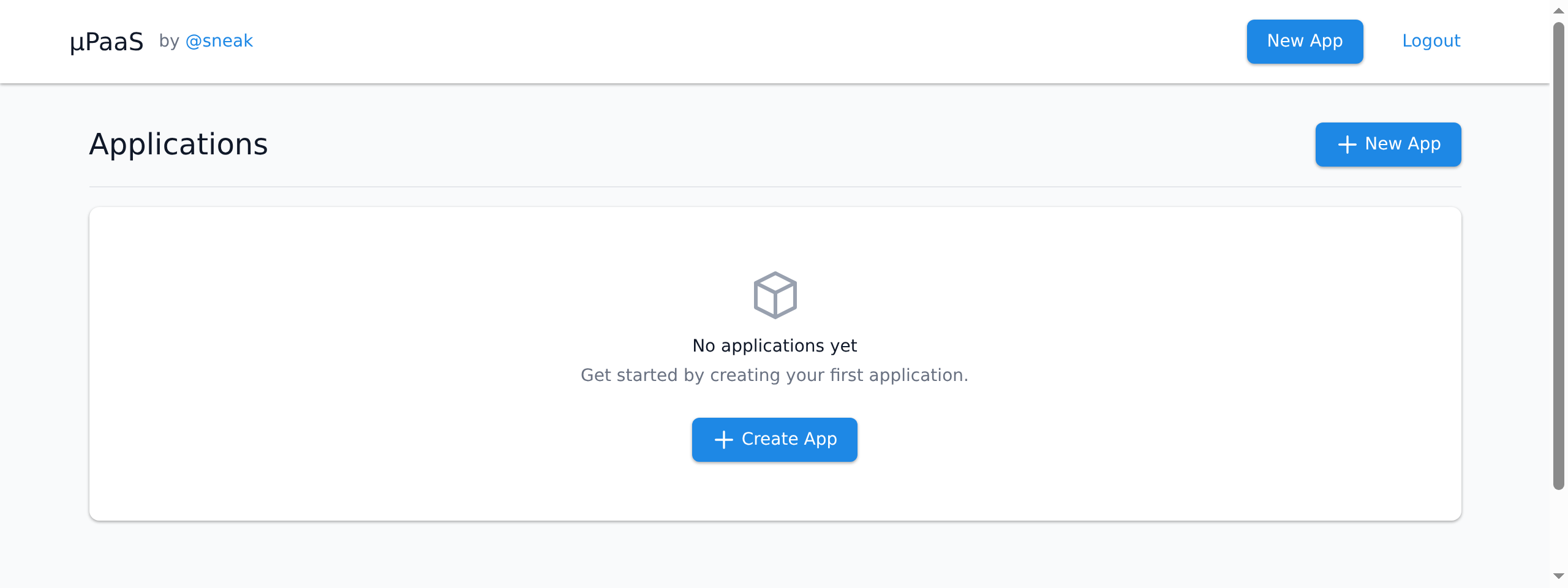 | 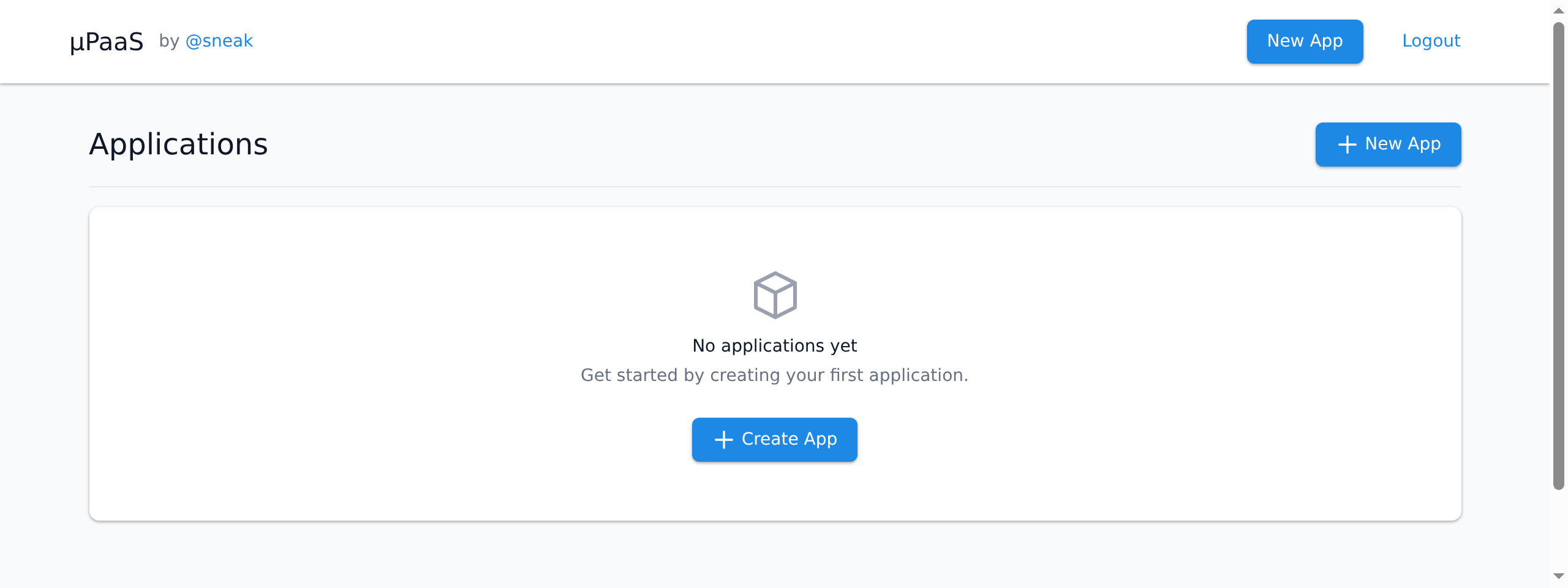 |
Model: opus-5-5
The top bar's two sides were held apart only by justify-between, with
no gap and no wrapping, so at 390 px "by @sneak" ended where the New
App button began. The bar's row now wraps and has a gap: in a window
too narrow for one row, New App and Logout move to a second row; on
wider windows the bar looks as before.

Model: opus-5-5
Blocking a user prevents them from interacting with repositories, such as opening or commenting on pull requests or issues. Learn more about blocking a user.


In a narrow window the top bar's two sides, "µPaaS by @sneak" and the New App and Logout buttons, ran into each other. The cause: only
justify-betweenheld them apart, with no gap and no wrapping, so at 390 px "@sneak" ended 2 px before the New App button. At any narrower width, or with wider fonts, the gap was gone entirely.The bar's row now has
flex-wrapandgap-3. When one row is too narrow (below about 400 px with the fonts in the screenshots), New App and Logout move to a second row, left-aligned. Wider windows keep one row with at least that gap. The desktop layout is unchanged. The top bar is the same on every logged-in page; the screenshots show the dashboard.static/css/tailwind.csshas no build step in the repo, so the fix uses only classes the committed file already has; the file is unchanged. That ruled out hiding "by @sneak" on small screens, which would needsm:inline. The duplicate New App button stays.The test checks that the bar's row carries the wrap and gap classes. Whether anything overlaps depends on rendering, which the screenshots show.
Screenshots of a local build, logged in, in a headless browser (taken at twice the pixel density):
Model: opus-5-5
Review passed.
Model: opus-5-5
d0f1348f50to12cc46e0f2Review passed.
Model: opus-5-5